News
In conversation with Cereal Magazine
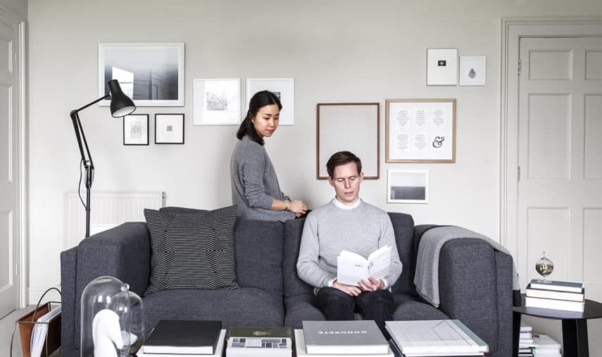
Interview by Talib Choudhry, Design Editor at Telegraph Magazine and Editor-at-Large ELLE Decoration UK. Photos taken at Rosa and Rich’s home in Bath.
Rosa Park and Rich Stapleton are work and life partners who founded the cult bi-annual lifestyle magazine Cereal in 2012. Since then they have amassed a global following thanks to their knack for combining thoughtful words, beautiful imagery and pared back graphic design to striking effect. The duo travel the globe to produce stories for Cereal and personally try out anything they recommend, giving the magazine a feeling of authenticity that resonates through its pages. But while they say that Cereal ‘is about going on an adventure, seeing the world, and experiencing and learning new things at whatever pace you fancy’ their home in a Georgian Square in Bath is their favourite place because ‘it’s where our family and friends are and nothing can compare with that’. We caught with them over a cup of tea to discuss all things Cereal and what makes great design
Describe your average day…
Rosa: There isn’t really an average day for me as I’m mostly on the road for work, but if I’m not travelling, my working day is broken down into breakfast at Hart’s Bakery in Bristol with the morning dedicated to meetings and calls, followed by lunch at Friska and ending the day with a power session of emailing and planning.
Rich: Generally, my day tends to be a mix of photography, design and art direction. This includes developing the magazine design and layout, traveling and taking photos, or briefing a contributor for an upcoming feature.
What’s the best / worst part of what you do?
Rosa: The best part is creating the magazine and meeting the many wonderful, interesting people that I encounter during that process. The worst part, I suppose, is the hard line I often have to take with the business; that means delivering difficult news to people I admire and respect, which is never easy.
Rich: The constant travel is both the best and worst part of the job for me. There is nothing better than having the opportunity to explore new destinations and cultures, providing an ever-changing backdrop for inspiration and content creation. That being said, there is something valuable in the quiet reassurance of routine. When I’m on the road, I often long for the simple comforts of home and the sense of stability and purpose that comes with a daily process.
Why do you think the magazine resonates with people?
Rosa: I believe it’s the personal nature of our content. Our readers can depend on the fact that either myself or Rich has visited and experienced everything first hand before recommending it to them. Perhaps it won’t be sustainable forever, but in the early stages of our business – we celebrated our three year anniversary last week – this approach is crucial to us and our ethos. I think that level of commitment and sincerity in what we do comes through, and our readers can emotionally connect with it.
How would you describe the Cereal aesthetic?
Rosa: Clean and calming. And hopefully timeless when we look back on it 20, 30 years from now.
Rich: Modern, uncluttered and focused. Readers have commented that we have a Scandinavian look and feel, and I would agree with that to some extent. The general aesthetic is minimal and paired back, with lots of negative space and muted tones.

Who would you say the readership is?
Rosa: Our readership is comprised of our peers. When we first started the magazine, we produced a title that we would want to read, and that our friends would want to read.
Rich: They are design-conscious professionals who need not only the quality to be of a high standard, but the aesthetic sensibilities too. You could compare it to a restaurant whose food, service and interiors are all equally excellent.
How do think living in Bath impacts on the magazine?
Rosa: Bath has had a profound influence on the title. I moved to this part of the world from New York five years ago, and I feel at ease here. That sense of calm infiltrates the magazine. Bath is also an incredibly beautiful city and one that is very uniform in its look. That kind of singularity in aesthetic vision is also present in Cereal.
Rich: We live in Bath and work in Bristol, and this mix of environments feeds into and influences what we create. Bath has a calm, consistent disposition and a great sense of history. Bristol on the other hand is young and vibrant; there is a real sense of energy and entrepreneurial spirit here.
What do you admire about Anglepoise®’s lighting designs?
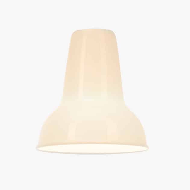
Rosa: How iconic they are. An Anglepoise® lamp, for me, is instantly recognisable and the style never dates. I’m always drawn to classic designs – that’s my thing, if you will. Very few companies do classic design as well as Anglepoise® does. And for that reason and beyond, I have an immense love and respect for the brand.
Rich: The beauty of Anglepoise® is the simplicity of its design. I appreciate the subtlety of a 3 spring system to create balance, and I value its historic tie to the workings of automotive suspension.
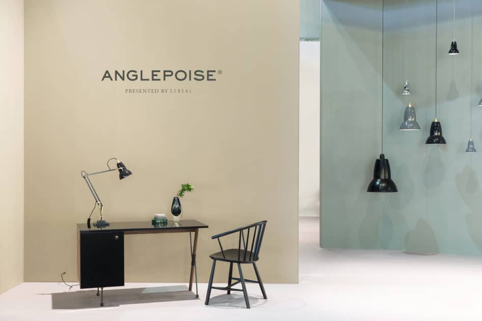
Tell us about your project with Anglepoise® at the Milan Furniture Fair last April…
Rosa: It was one of the most wonderful things that has ever happened at Cereal. Everything came to be very organically, and things clicked into place just in time for the collaboration to materialise. When we were researching potential story ideas for a chapter of the magazine about Bath, we discovered that the Anglepoise® lamp was invented in Bath. Being a massive fan of the brand and owning many Anglepoise® lamps, I loved finding out that my current hometown gave birth to such an iconic lamp and we decided to do a story on the history and origins of the first Anglepoise® lamp.
Rich: We then got a stylist and photographer to create the visual imagery to accompany the story in Cereal style that was sympathetic to the brand’s sensibilities. When the magazine with this story was published, we got a lovely phone call from Anglepoise® asking us if we’d like to style their stand at Euroluce to look like the images from our magazine. How could we say no to that? It was such a fun project to work on, alongside our stylist Nathalie Schwer, and truly a highlight of the year for me. It’s not everyday that the pages of Cereal manifest in 3D format.
What’s coming up next?
Rosa: We have just sent Cereal Volume 11 to press as of this morning, so that will officially be launching on 21 March. There are many exciting projects bubbling away for the upcoming year, alongside our magazine and guidebooks, it’s going to be another fun year!
Objects of Desire – Rosa and Rich’s design picks
Rosa
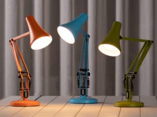
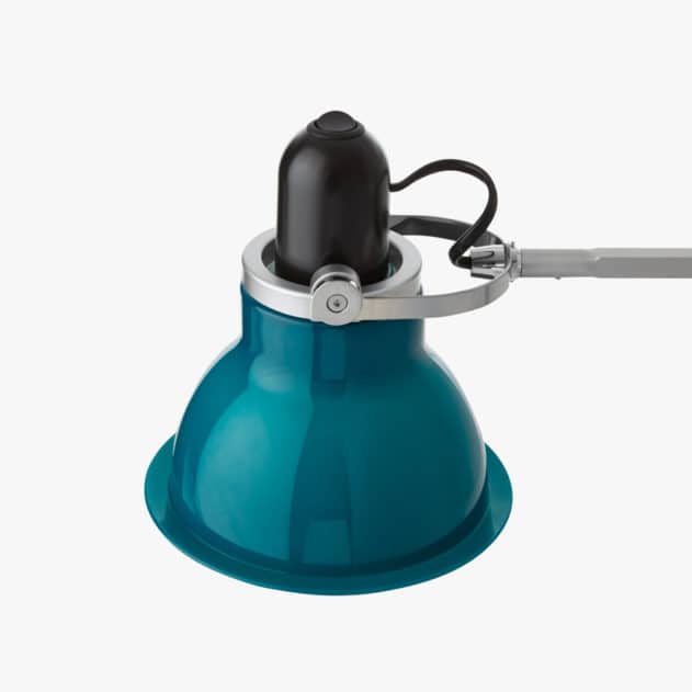
1. Anglepoise® Type 75™ Desk Lamp: Handsome, functional and affordable. Ticks all the boxes. We currently have 3 in the flat.
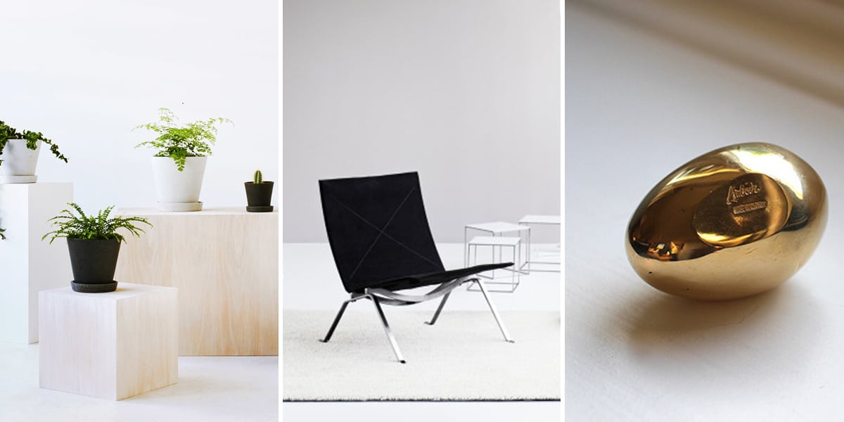
2. Fritz Hansen PK22 chair: I love the elegance and restraint in this chair design. I hope to own a set in the near future for my living room. I’d have it by the window so it creates a lovely reading nook.
3. Carl Aubock brass paperweight egg: Simplicity in form that’s attractive and comforting. And of course, perfect for keeping all my documents in one, neat stack.
4. Hermes Samarcande horse paperweight in white porcelain: I don’t use this as a paperweight, it’s a decorative piece that sits on my mantle. It’s a design that exudes understated luxury. I love the subtle contours as well as the smooth, silky finish. It’s perfect.
5. HAY concrete plant pot: It’s surprisingly difficult to find a nice indoor plant pot. I’ve been searching for a while then came across the HAY ones last year, and now these are the only ones I use at home. I think they got the shade of grey just right. It’s a lovely contrast to my dark green succulents and cacti.
Rich
1. The Kostick star – A fusion of science and art, its bronze geometric structure has the ability to completely collapse and reopen with a single movement.
2. Hasselblad 503CW – A medium format camera. Completely manual, it doesn’t have a screen or need batteries, but creates beautiful images that rival or in many cases surpass, some of the best cameras on the market today. A true feat of optical engineering.
3. Midori ruler – Constructed from aluminium, it serves as both a ruler and a protractor. At full length, it measures 30cm, but then pivots seamlessly to form a 15cm version – meaning it is both practical and portable. It has changed the way I work with straight edges.
4. Kime toothpick holder – A seemingly classic wooden case hand carved with a smooth undulation on the inside, resulting in a wave like display of the toothpicks.
5. Nomos Lambda – An elegant timepiece crafted in the small german town of Glashutte. It is at heart a classic fine watch, with intricate details and world class precision. However, unlike many in its class, it also employs beautifully restrained styling and is housed in a thin, modern casing.
Thanks to Talib Choudhry & Cereal Magazine. Follow them below:
Talib Choudhry
Rosa Park
Rich Stapleton
Cereal Magazine
Photos:
Cereal Magazine – Rich Stapleton
FritzHansen.com
Nomos-Glasshuette.com
NalataNalata.com
the189.com
The Design Files

